I’ve been dabbling with the idea of using a new prototyping tool for a while now. In the past I’ve used Marvel App which is great because it’s easy to create and share your prototypes. Plus, it’s web based and free. Although Marvel (and InVision etc) offer quick and easy solutions they really represent the early stages of an app. These tools are best used to get something in your hands to understand the flow of your app. They’re great for throwing together quick PSD mockups or even pen and paper sketches.
This is great and works especially well for simple apps (or websites) or in the early stages of the process. Apps today, and most digital design for that matter, utilize a lot of amazing animation and motion graphics to enhance the user experience. These lower fidelity prototyping tools are great for what they do, but it left me yearning for more.
The main difference between what I consider lower fidelity vs high fidelity is page vs layered prototyping. This article and this follow up by Tes (cptv8.com) explains the difference. Tes gets more in depth about multiple tools and compares 8 of the biggest high fidelity prototyping tools. The focus of this post is my experience with Principle App (which I decided to use based on the aformentioned articles).
I should start by saying that Principle is for Mac and iOS only. Principle states that the app was built on core OSX properties or whatever and there are no plans to expand to Windows or Android. A slight fallback if you’re a Windows user but I must say that if you’re a UI/UX Designer you’re probably using a Mac anyway, right? So let’s jump into it.

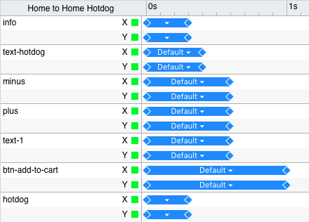
So this is how the app looks like so you can get an idea if you’re unfamiliar. This project is rather complex so it may look a bit confusing to newbies. It’s all a rather basic and straightforward setup; layers panel on the left and a preview panel on the right with artboards in the middle. Getting the hang of the app as a Creative Suite user (or Sketch) is a breeze. Especially with the handful of great tutorials out there.


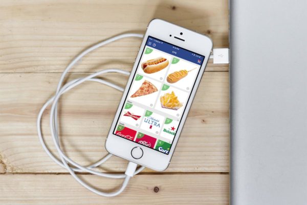
I created a full working prototype of our app Order to Seat so it appears complex. Although the nice thing is that if you have an idea and want to quickly wireframe something out you don’t even have to open Photoshop or Sketch. You can open up the app and wireframe something with simple shapes rather quickly. It’s great for full working prototypes but it’s also nice to share ideas with your coworkers when you’re talking about gestures and animations that aren’t easy to explain.
The other benefit is that you can load anything you’re working on straight to your phone with their app Principle Mirror. It’s nothing exciting but works exactly how I’d expect – you plug in your phone and it loads whatever project you have open. You have to connect via USB but it’s quick and you don’t have to save your project and will still run after disconnecting. Or you can load projects directly to your phone by opening a project file from your email / dropbox / etc which is really handy when sharing your project with stakeholders or potential investors.
Here’s my TL;DR summary and complaints:
All in all, my experiences were good. I really enjoy the high fidelity (with layers), the animation timelines (as seen in other apps) and how easy it is to export videos / gifs (like the one above). I also really like the Facebook community and like that Daniel Hooper (the creator of the app) is actively seen in there answering questions.
The only issues I have found is that the more complex files are large. Mine is 32MB – but I did use full @3x images that were not compressed/optimized so there’s that. The issue then is that it makes it harder to share with anyone. Downloading from the web takes a minute or two and then opening the project is finicky. I wish there was a way to save project files directly to the app. Also it’s iOS only so I can only share it with other iOS users which kind of stinks but is understandable. The fallback is exporting a video which is really easy.


